Case Study — COOPER PRODUCTIONS
Cooper Productions is a videography company that specializes in creative brand and company shorts, architectural videos, and documentary films. Founder and CEO, Marissa Cooper needed a brand that would stand out within the industry and is personal, creative, and tech-forward. This identity is loud, maximalist, and quick-witted.
Produced at Worboys
Art Direction: Kyle Read
Design: Jessa Youngbloom
Services
Brand Identity
Logo Icons


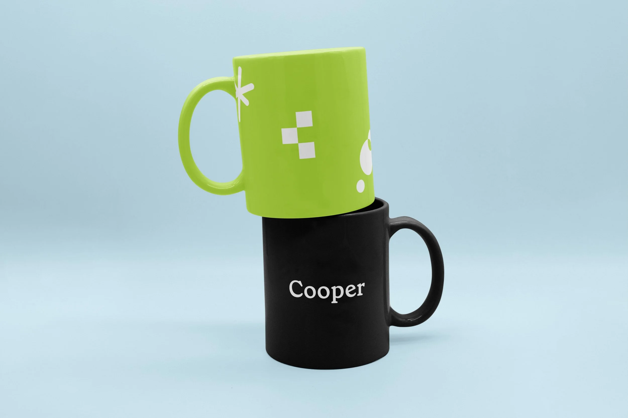
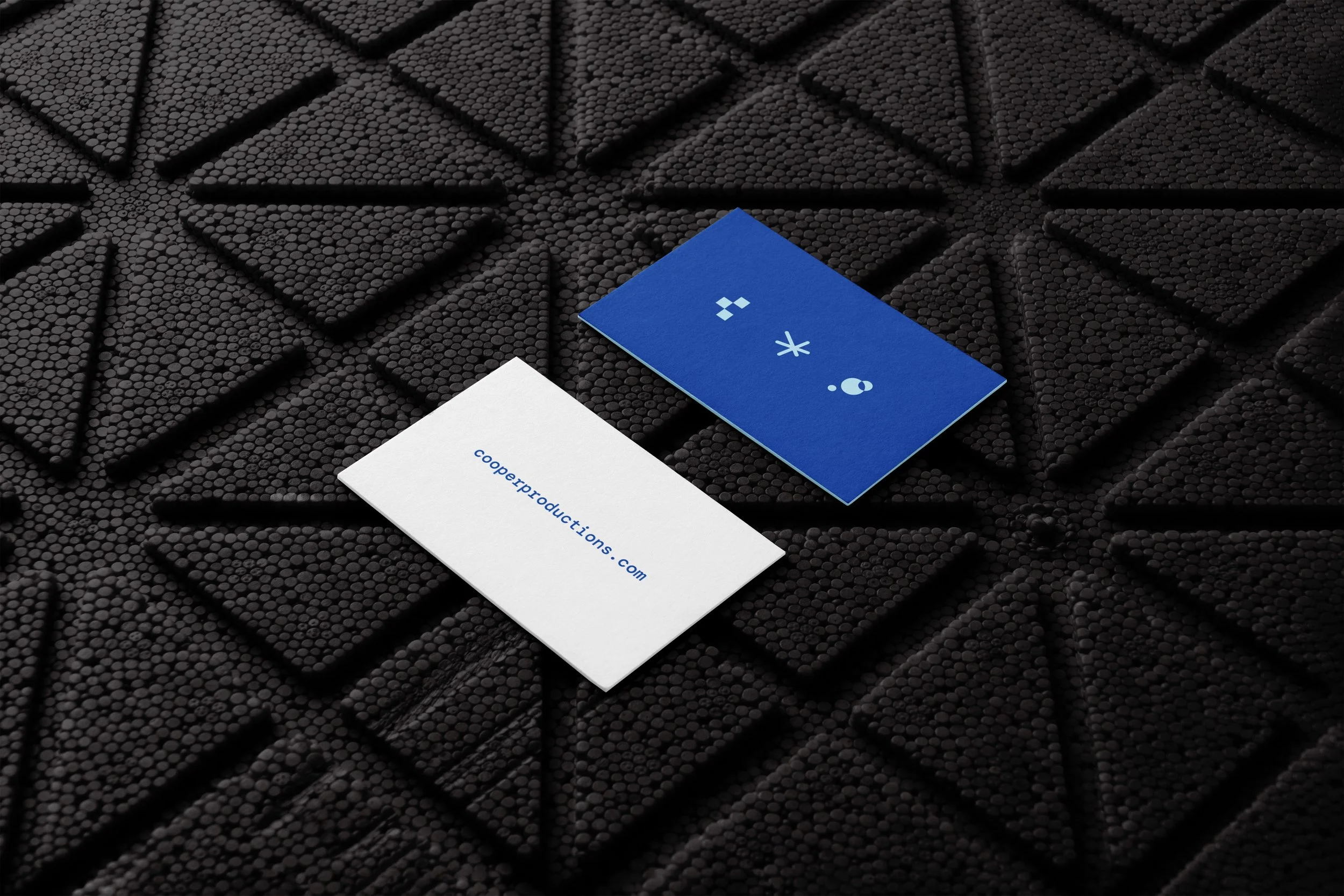
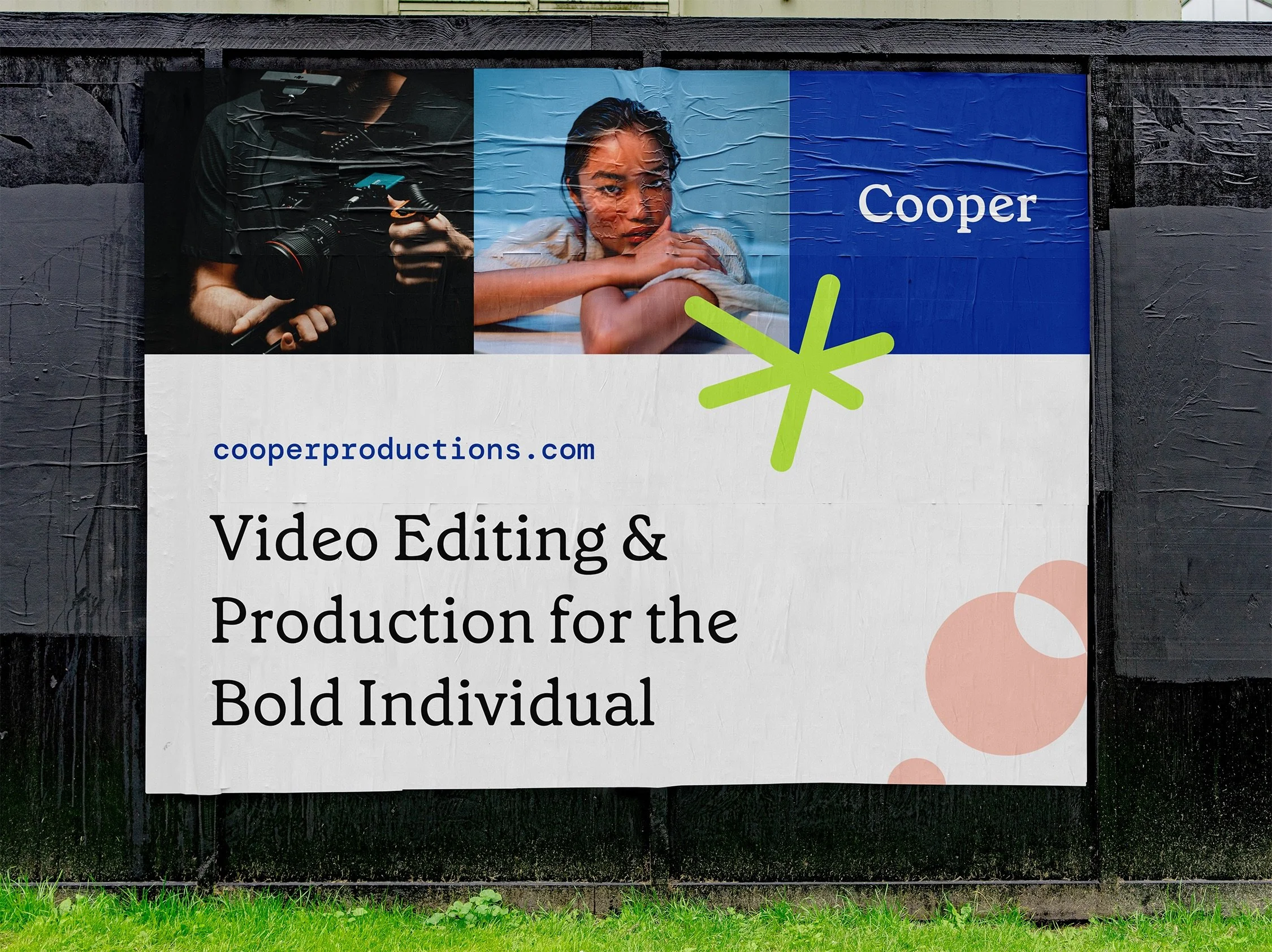
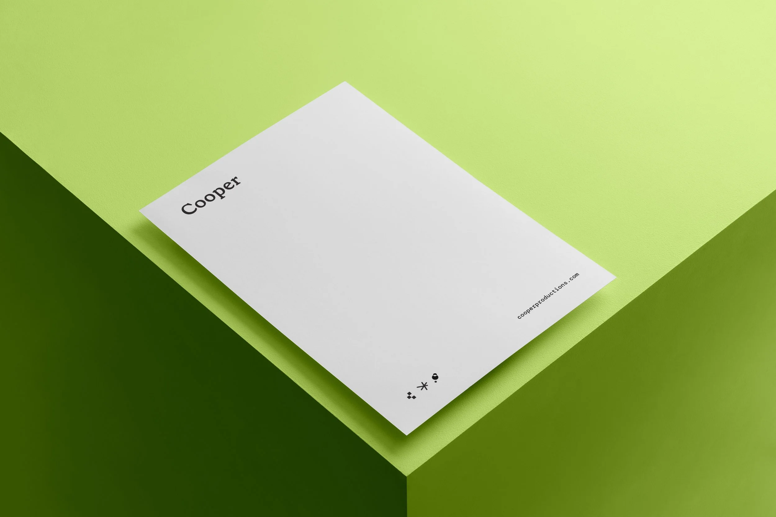
The pixel “C” represents the name “Cooper” itself and the technical skill needed within the digital world of videography. The star represents Marissa’s jovial personality and unique ability to add a personal touch to their portfolio of work. The lens flare represents their creativity and artistry in capturing shots in the field. All three icons express the rule of thirds used within videography. Three squares, three lines, and three circles.
Wordmark


The classical serif font grounds the brand identity in an experienced and professional manner. The rounded corners of the intelligent serif play on the idea of human touch within the brand strategy. The unconventional icons paired with the stripped-down and simple “Cooper” word mark create a provocative and complete identity system.
For instances where “Cooper Productions” is needed, we offered a tertiary mark that incorporates the most prominent icon.
Color Palette

The color palette is bright, clever, and energized. It is indicative of a larger brand or operation that quite plainly asks for your attention. It takes up space in an industry that can be challenging to stand out in. The RGB color palette ties back to the digital and technical skills that Marissa Cooper demonstrates throughout their portfolio.
Application